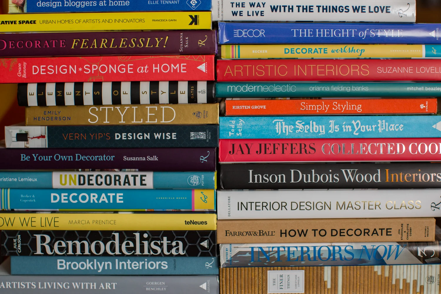
In order to make a good food photograph there are a bunch of things that go on behind the scenes. I thought I would lift the curtain and let you in on what I did in order to photograph a cake earlier this week. As the ideas start to form I am looking for a couple of things. First, I think there should a unifying theme that tells some kind of story to draw you in. Second it should be appealing to look at, and since we are talking about food it should appeal to your appetite as well.
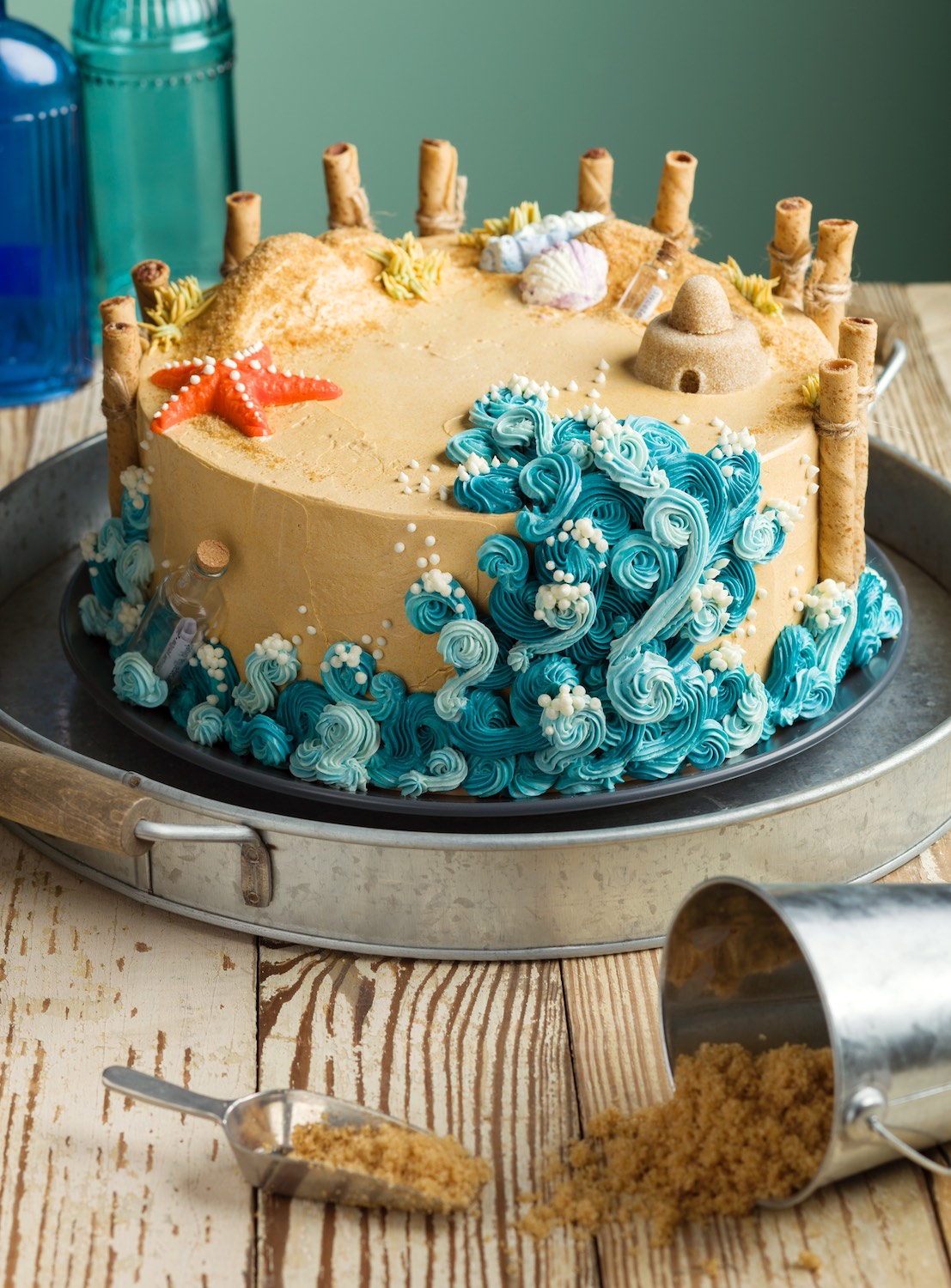
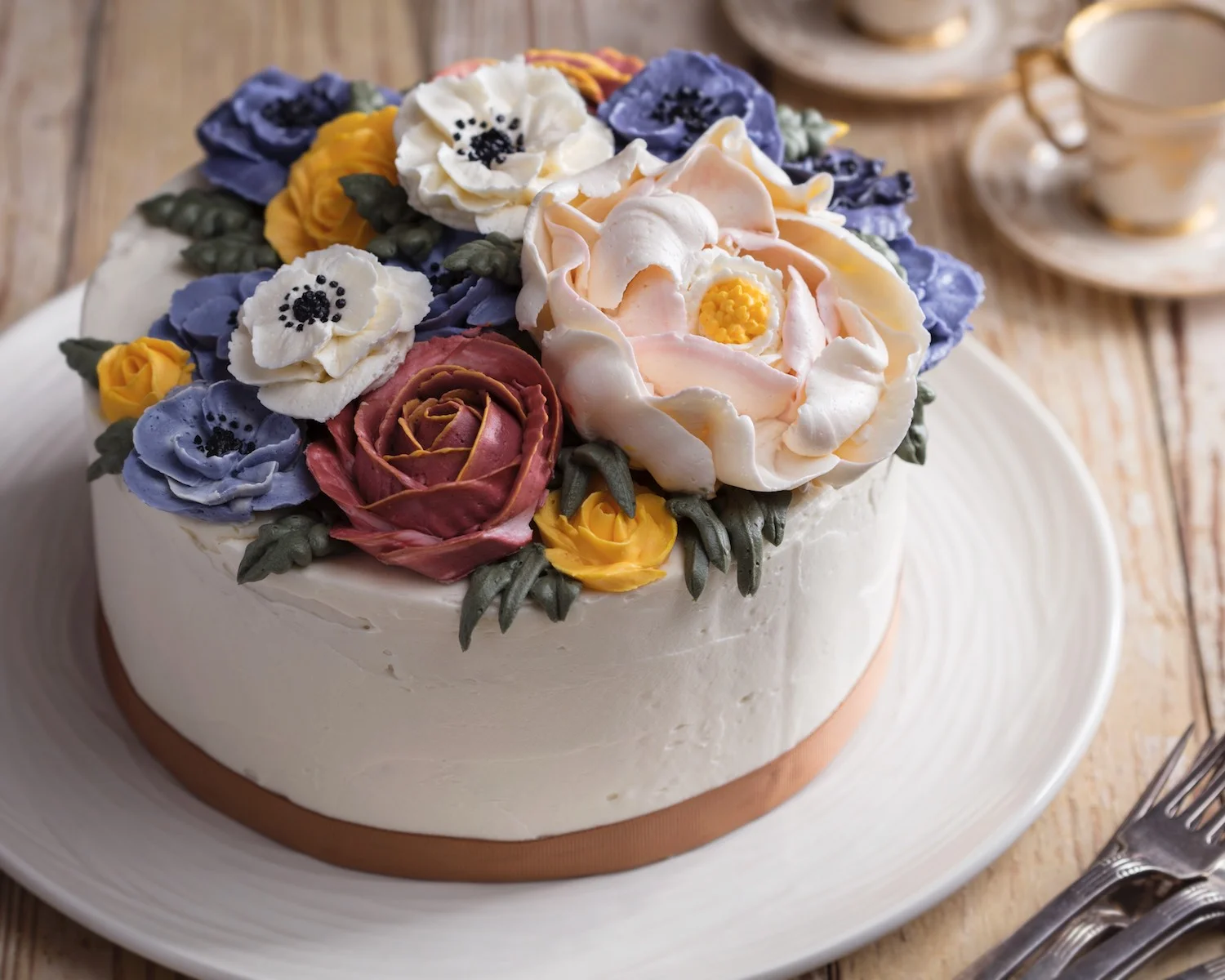
Before I got the actual cake in my hands I started out with a iPhone picture. It was helpful because it allowed me to start thinking of how I might approach the photo. Looking at the cake I can start to make decisions. I first start with adjectives to come up with some kind of theme. The cake is beautiful, flowery, feminine, detailed, uses flowing organic forms. The cake feels sophisticated, rather than a super punchy palette of colors it has a mellower dusty kind of palette. It feels British and reminds me of floral textiles. Then, there is the sheer volume of the flowers, this is bold and expressionistic. This cake has personality!

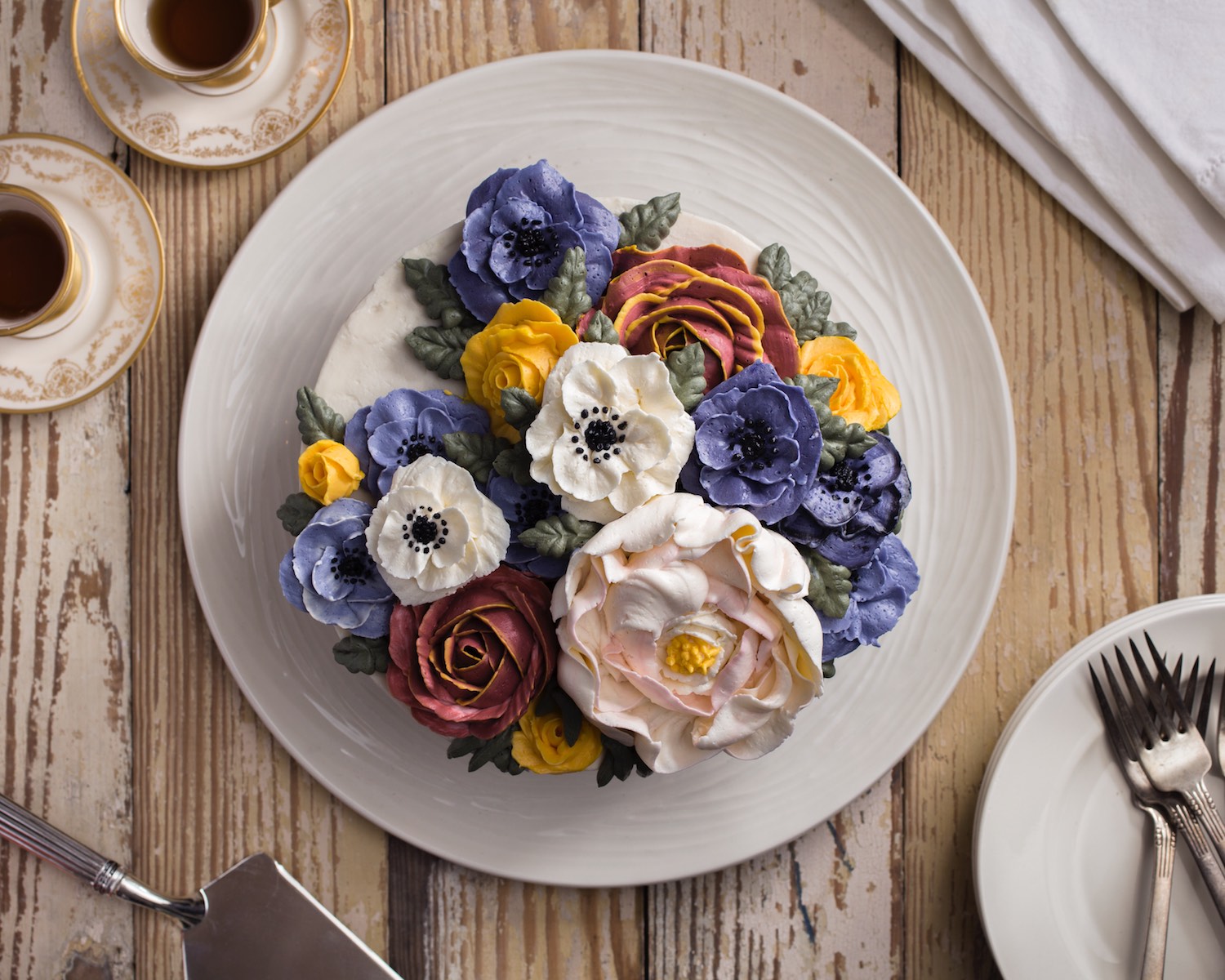
Wider shot, doesn't crop the plate.
The real star of the show is the cake, everything else is there to allow the eye to move around the picture and to enhance the subject. So I am looking for things that aren’t screaming for attention but gently enhance. I decided, since the color was more subdued, that there should be relatively little color in the surrounding background. For the wall I decided to use a pale color that mimicked the color theme of the cake. I tried both the dusty rose and gray blue and felt that the gray blue gave more depth. I have 4’x4’ sheets of wood painted all sorts of colors to use as walls, so changing a wall color is a simple as sliding in a new sheet of wood. For the tabletop I decided to keep the color subdued as well. The tabletop is one of many that I have at the ready and is made of reclaimed wood from an old house. I have slats of all colors and textures that I can easily throw down for totally different looks. I decided to use these particular pieces because I felt that the cake’s dusty colors and delicate flowers felt somewhat nostalgic or heirloom and that more antique surface would play nicely with that theme.

A tight vertical image. Verticals are more common for print, horizontals for web use.
Props are a crucial part of food photography especially with cakes, since the shape is so uniform from cake to cake. The familiar pill shape of a cake can get boring very quickly, so different shapes can break up the form and keep things interesting. I feel like in this case theprops not only break up the monotony of a plain background but feel inviting as though the cake is just about to be cut and served and tea enjoyed. The demitasse cups play off of the delicate nature of the flower decorations and pick up colors in the theme. The plates and linen were actually more pure white than they are in the finished versions. I toned them slightly warmer to match the cake and cups and suggest through the styling that this is a buttercream cake. Finally the cake plate is a bit of a nod to the bold flowers. The swirly pattern is a playful reminder of icing that keeps the whole thing contemporary and playful as a counterpoint to the antique cups and surface.

A wider vertical image with no cropping of the plate. One reason it pays to have different versions is if there might be text used over the image once it is printed.
Once props are decided on then I typically look for the front of the dish, there always seems to be a best angle for a plate. Everything gets put in place, and I am ready to start shooting pictures. Since I have a bunch of time with a cake I will look at the photos on my iPad and determine if things could look any better. Often I will make a million tiny adjustments till things are just right. Then, I will try a number of angles, close, low, high, overhead, till I know I have the shot. For this cake I got 5 variations that I like, and in all I made 44 exposures. Some of the exposures had different lighting or different arrangements but in the end there were 5 clear winners.
I am really fond of this one as well. The lighting is a little crisper. For the photography nerds out there, I used a beauty dish with some bounced fill, it really gives it a nice contrast.
As you may now know, there are a bunch of considerations to make when doing food photography. All of this doesn’t even begin to speak of the artistry of the cake itself, which was made by Berlyn Mellein of Honey and Rose Bakery. Berlyn sells her amazing cakes, cupcakes and baked goods at Artisan Exchange in West Chester. If you get chance visit her Honey and Rose Bakery Facebook page. I am often asked if I get to eat the food I photograph and in this case I can honestly say the cake was as delicious as it looked.
Thanks for reading, I love to hear from you and answer questions so if you have any please don't be shy. If you are a chef, baker, cook, restauranteur, food blogger, writer or food service business owner and need great food photography, I would love to hear about your project. Contact me for a free quote. If you would like to see more of my photography visit www.danieljacksonphoto.com